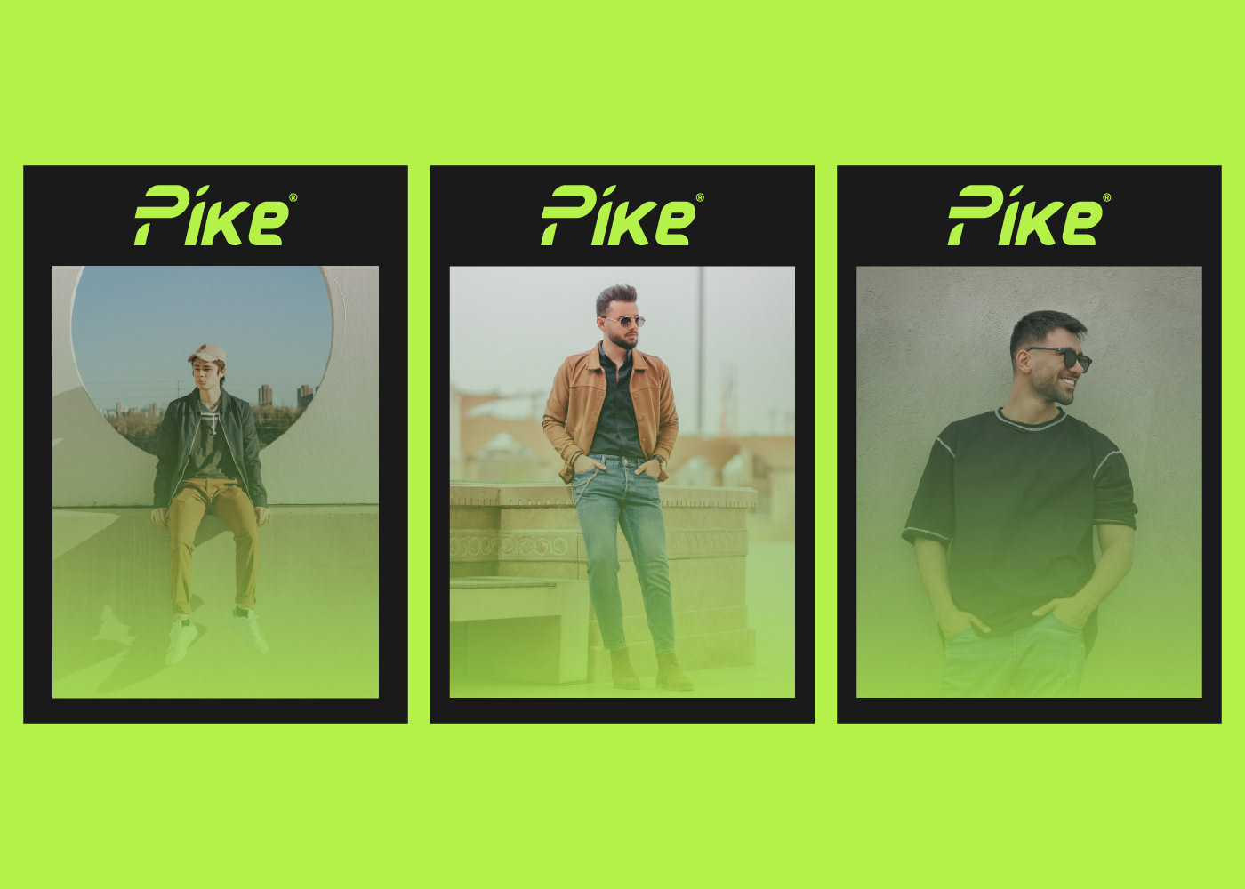
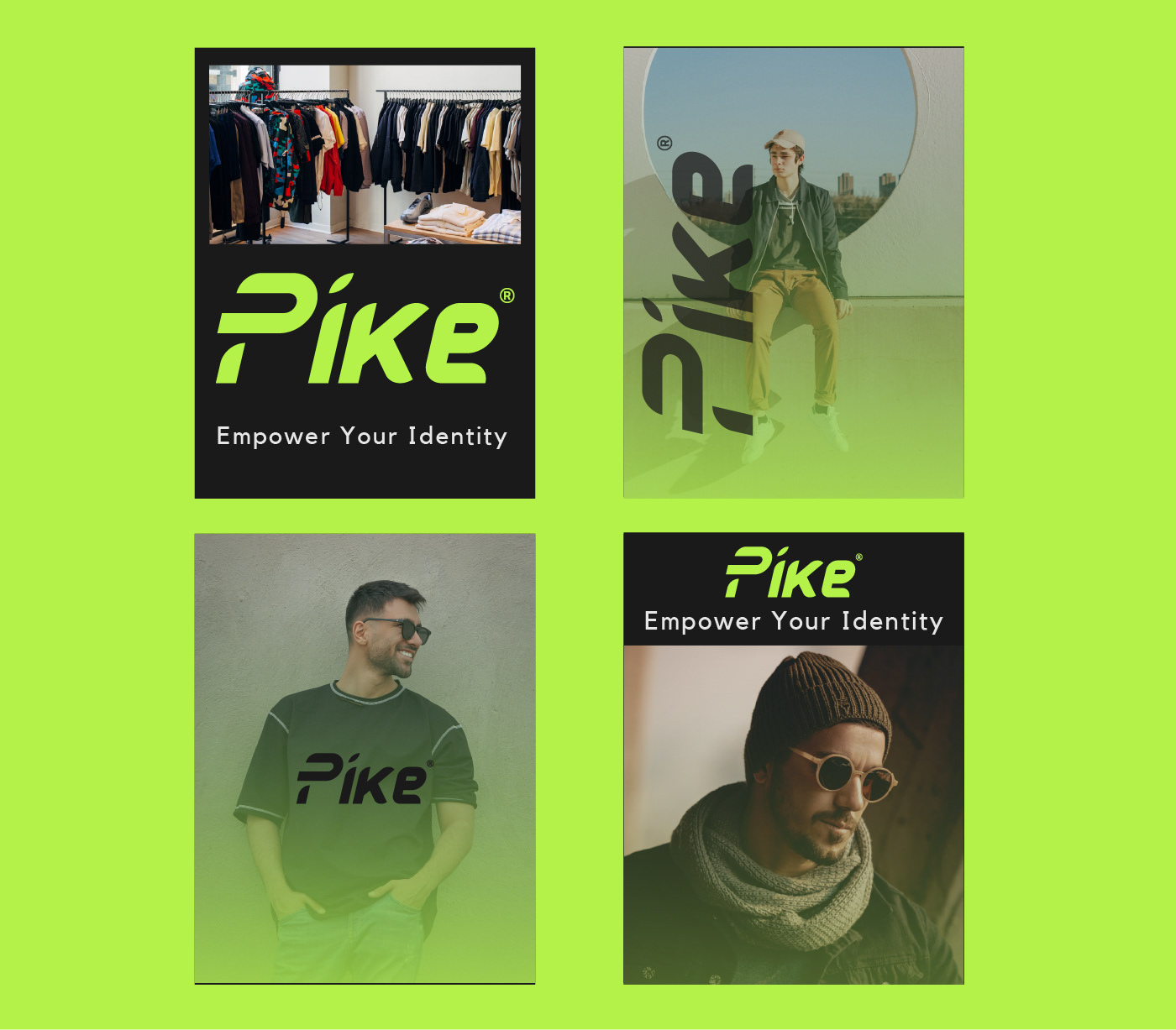
PIKE® - Visual Identity
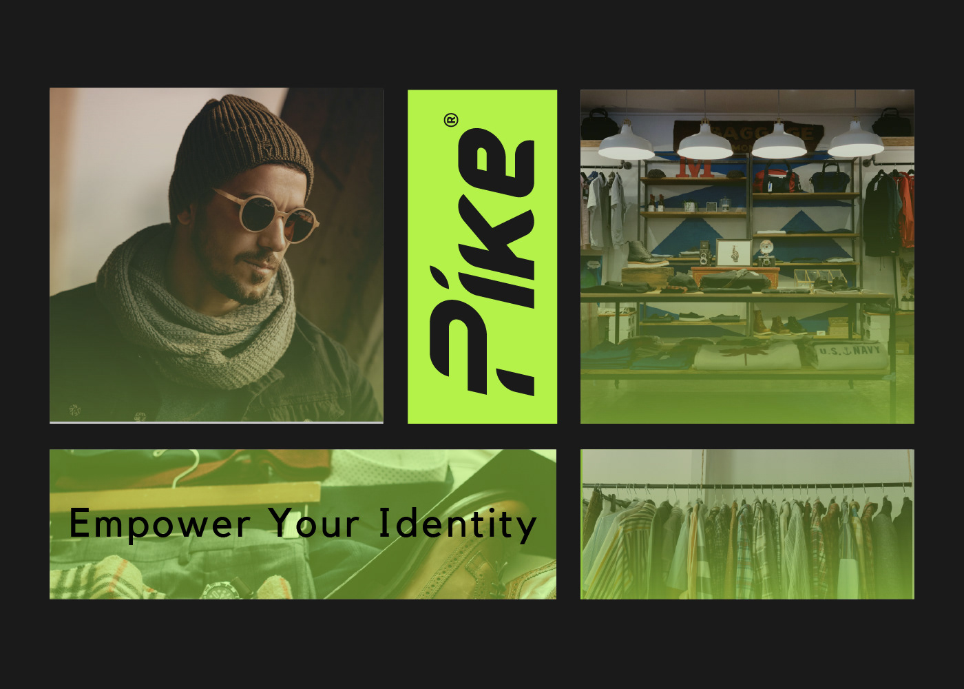
Pike is a men streetwear brand that aims to inspire and empower individuals through fashion. Their clothing line is designed to resonate with people who value self-expression, positivity, and social consciousness. They believe in spreading hope and optimism through Their unique streetwear designs that combine style, comfort, and meaningful messaging.

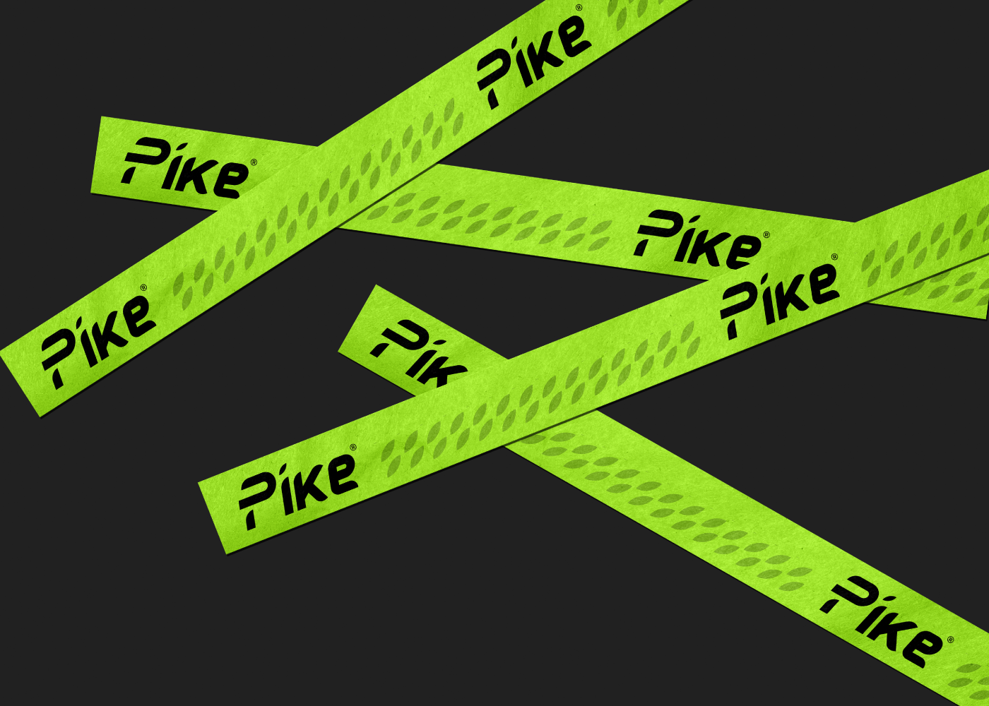
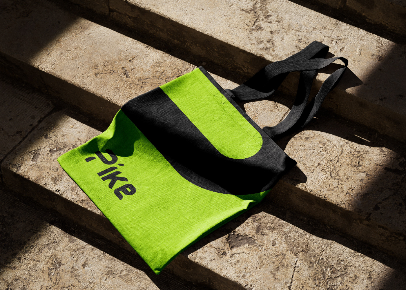
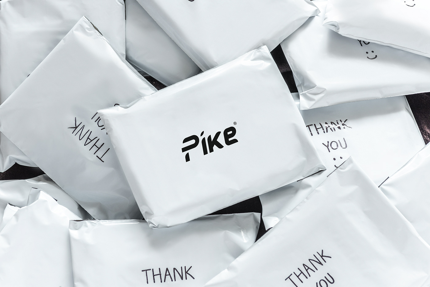
The Pike logo looks stylish and simple. It uses abstract letters that make it look modern and unique. The letters are close together but still easy to read because they don't touch. The logo is all one color, and the letters look great in Phosphoric because they're bold and show that the brand is strong and dependable.

Challenge:
Pike faces challenges in a tough market: staying relevant as trends change, making people recognize the brand, and keeping a consistent image while growing. To overcome these challenges, Pike needs a strong plan and should focus on building its unique brand.

Solution:
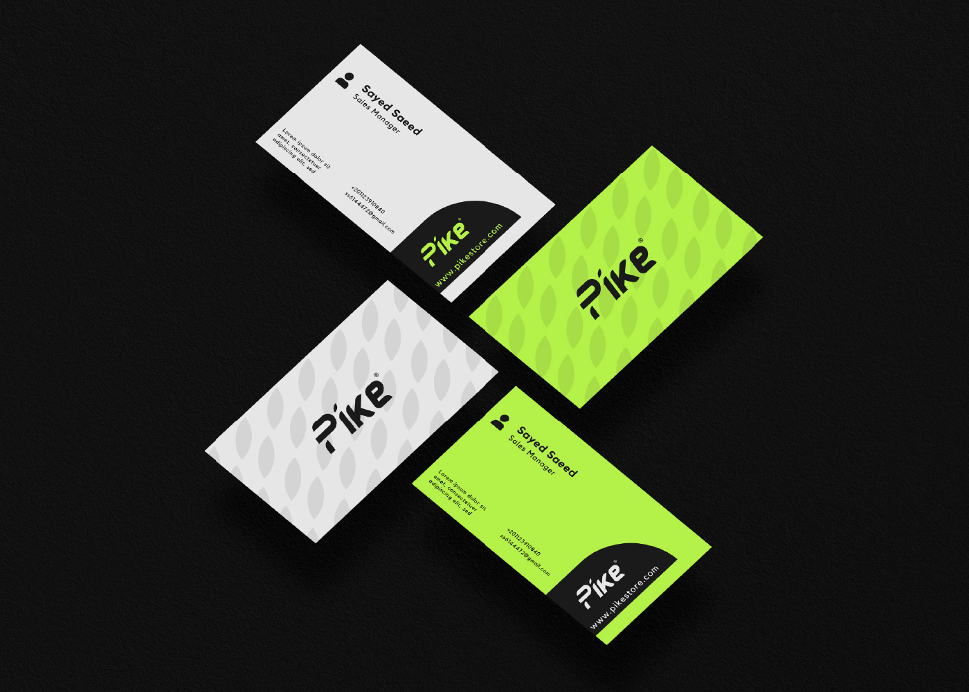
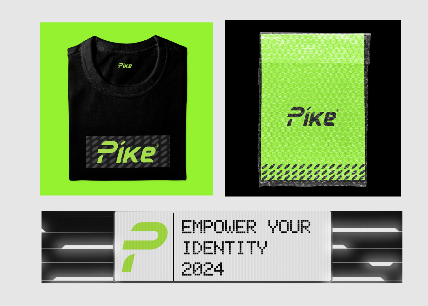
We started by making a clear plan for Pike's brand. We figured out what the brand stands for, what it wants to achieve, and who it's meant for. Then, we made a unique look for Pike that makes it different from other similar brands and connects with its customers. This included creating a new logo, a visual style guide, and updating marketing materials.